During the low-season, you always want a change. Someone renews the wardrobe, and someone decides to make repairs at home. A 'change of scenery' is always an exciting decision. But the question creeps into my head: “What if the interior that we have chosen quickly gets boring?”
To prevent this from happening, you need to carefully do your repair.
The color scheme is the cornerstone for any interior. It serves as a "substrate" for the entire design, and sets the mood. However, it cannot be changed every month. So the choice of color should be approached especially carefully.
We are going to offer you three solutions that have possible advantages:
- do not look boring and monotonous;
- suitable for almost any chosen style - from baroque to hi-tech;
- fit into the interior of any room - from the bedroom to the bathroom;
- do not require special knowledge and are not difficult.
1. Buttercream
It would seem that the color scheme, which is in a narrow range from milky white to moderate beige, will seem rather boring and monotonous. In fact, this amazing combination is wonderful because you can come up with many variations!
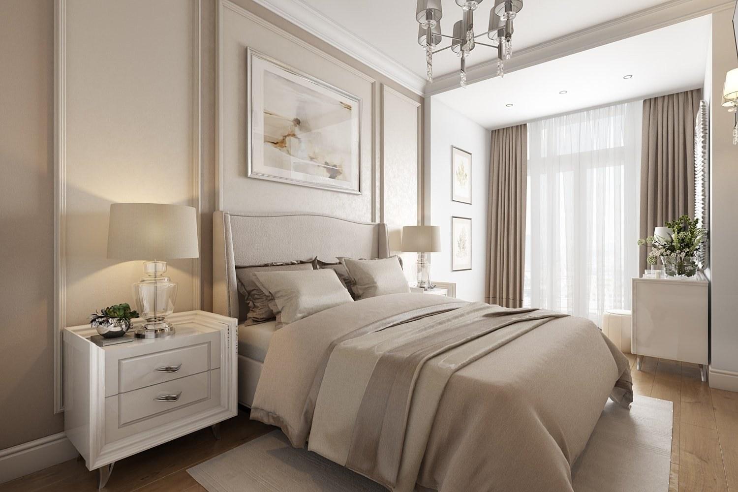
Yes, the buttercream color has a lot of shades, and all of them can be used in the interior. Thus, this is almost the only palette that can have at least 30 shades in one room, and it still looks harmonious.
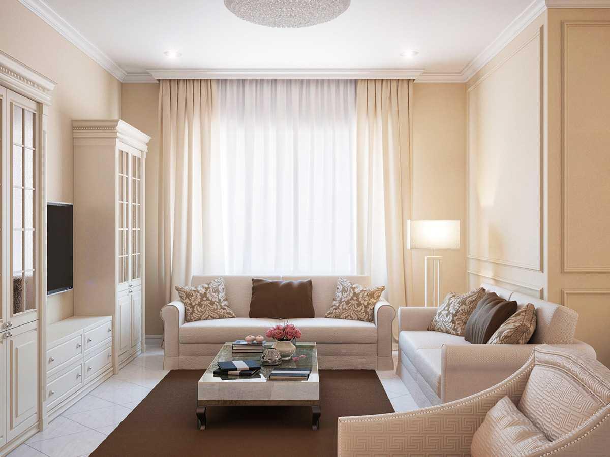
The main advantages of such a solution:
- the perfect background for any style and any room;
- ease of implementation: you don’t need several days, or even weeks, to run around the shops in search of the perfect tone for decoration, furniture, textiles: all shades of creamy and warm white blend so well with each other;
- room for creativity: later you can add colored “spots” - from drawings on the wall to bright furniture or decor;
- visual spaciousness and cleanliness: light and warm colors expand the space without making it too cold;
- budget: you can bring all ideas to life with high quality without high costs (both for materials and for the designer).
As mentioned above, it is difficult to spoil something here. All shades are perfectly combined with each other and at the same time may differ.
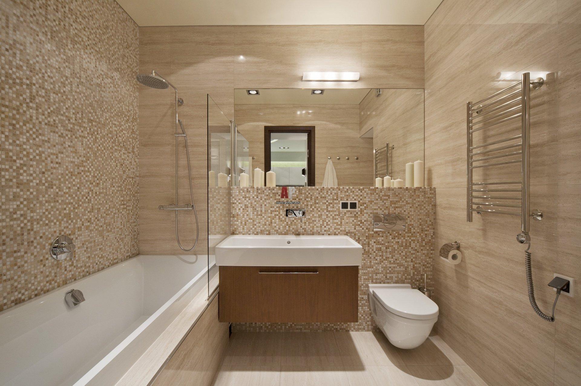
However, there are a few principles to follow for the most powerful effect:
- Don't use just one shade. It will make the room boring and monotonous. Instead of freshness, a feeling of longing will appear.
- Play with textures. Matte and rough - this is comfort, warmth, harmony. Glossy and smooth - this is freshness, novelty. You can combine textures and thereby achieve amazing results.
- Use eco-elements. Any style allows eco-elements in the interior - from the classic dried flower to the noble wood of light shades.
- Apply this color combination in a small or dimly lit room. You will see how it transforms.
- The creamy scale allows the use of cool shades - grayish-beige, coffee with milk, white-blue. They should be used with caution and dosed, so as not to make the room cold and look like an operating room.
To form the center of the composition, you can go in two ways. The first is to make the walls, ceiling and floor as light as possible, and place everything darker or colored just in the center. The second way is to play with textures. In this case, the floor, ceiling and walls should be as smooth and inconspicuous as possible, and the center of the composition should be textured and tactile.

Hint: You can add some silver and mirrored surfaces if your style allows.
Which rooms are suitable for creamy colors:
- living room - comfort and free space;
- bedroom - comfort, warmth, soft light and texture;
- kids room - cleanliness and natural freshness;
- office - for calm, measured and productive work;
- kitchen and dining room - space, harmonious light and comfort;
- bathroom and toilet - cleanliness and smoothness;
- utility rooms - functionality and cleanliness.
Please note that subsequently from the creamy range you can easily switch to other color combinations. For example, the color of the floor, walls and ceiling can be left the same, updating only the furniture and textiles. So, while maintaining the overall appearance and without major repairs, you can achieve dramatic changes in the interior.
2. Mediterranean coffee
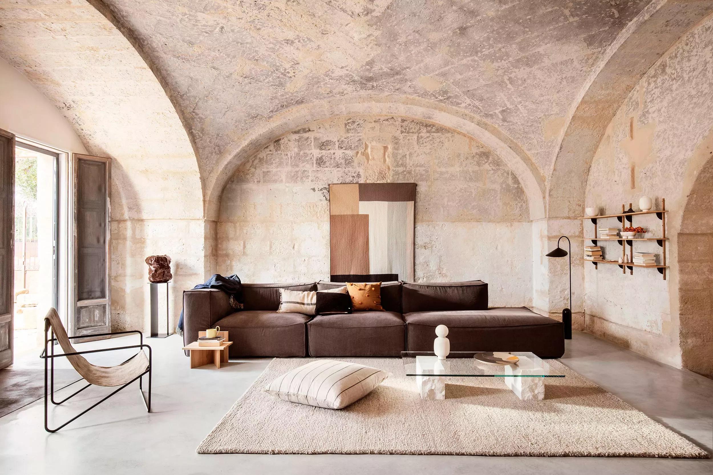
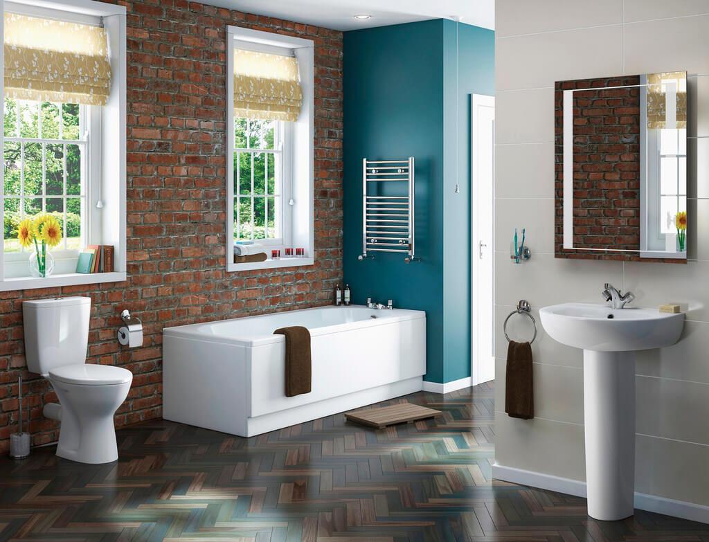
Despite the name, it is suitable for many styles, not just for the Mediterranean. It is one of the most beautiful, pleasing to the eye. At the same time, not boring and can be implemented in any order and sequence.
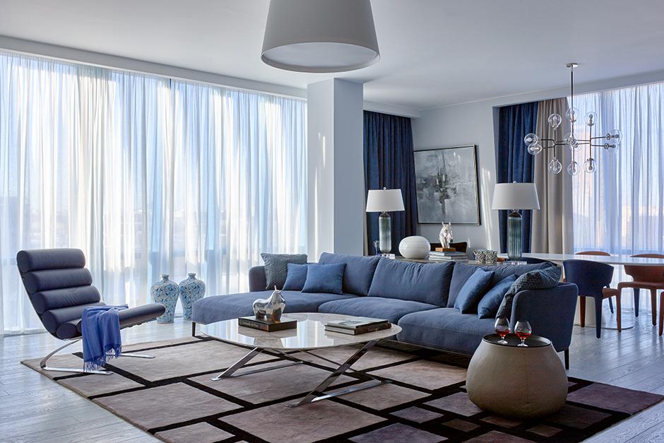
So the basics are:
- white;
- brown or dark beige;
- blue of any shade.
As you can see, this combination is easy to implement in a variety of shades, if only because white can be imagined as both boiling and quite warm. For example, milk or even ivory. There is no need to talk about "blue" at all. There are millions of variations. Due to them, you can choose what will be to your liking.
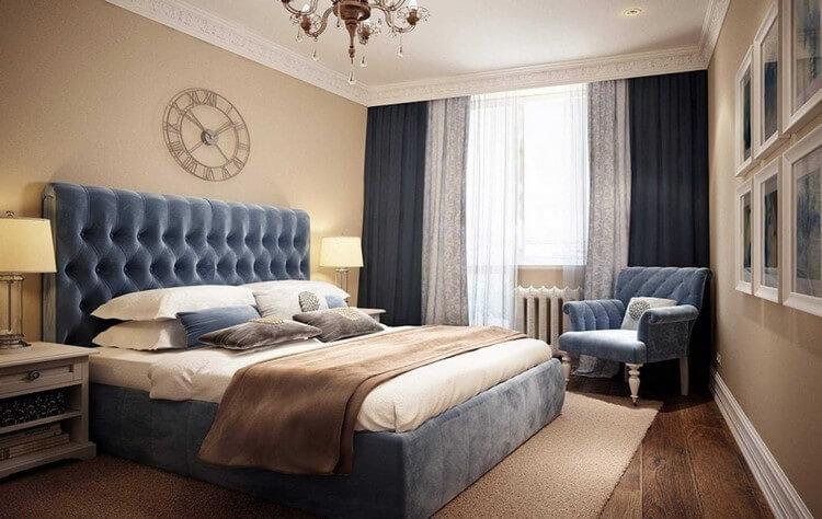
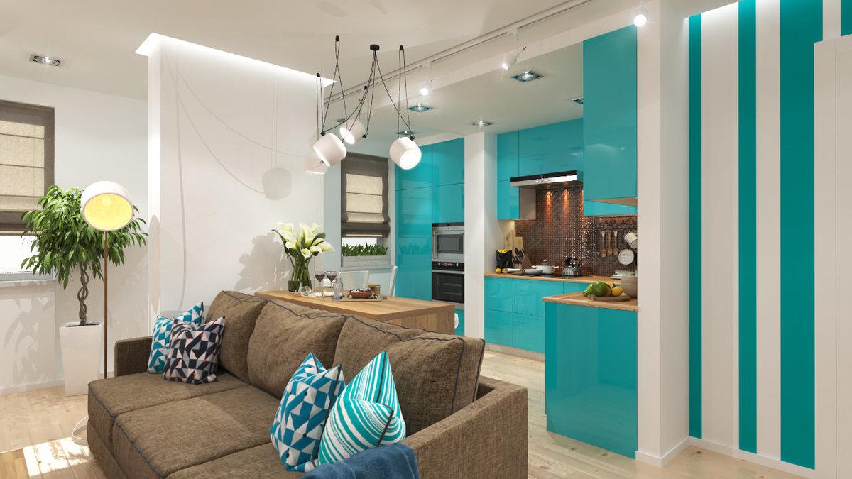
For simplicity and convenience, here are the brightest and simplest examples:
- boiled white + cocoa with milk + ultramarine (from pale to vivid);
- warm fresh white + coffee with milk + jeans (from light to deep);
- milky white + cinnamon + turquoise (from washed out to rich);
- boiling white + dark beige cold shade + azure blue;
- fresh white + taupe + periwinkle.
A few words should be said about the periwinkle. Pantone recognized this shade as the color of the year, and for good reason: it is bright and very beautiful, but at the same time it cannot be called intrusive. It creates an atmosphere of calm freshness, measured energy and charm.

In interiors, the periwinkle is most often framed with just the indicated two colors: white, which emphasizes freshness, and brown, which “smoothes the corners” and slightly reduces the contrast.
It should be noted that this color scheme is by no means limited to just three colors - you can use more shades, choosing a little darker and a little lighter. So, the design will look quite harmonious, where it is present: transparent turquoise, rich turquoise, white, light gray-beige, coffee with milk and a little coffee.
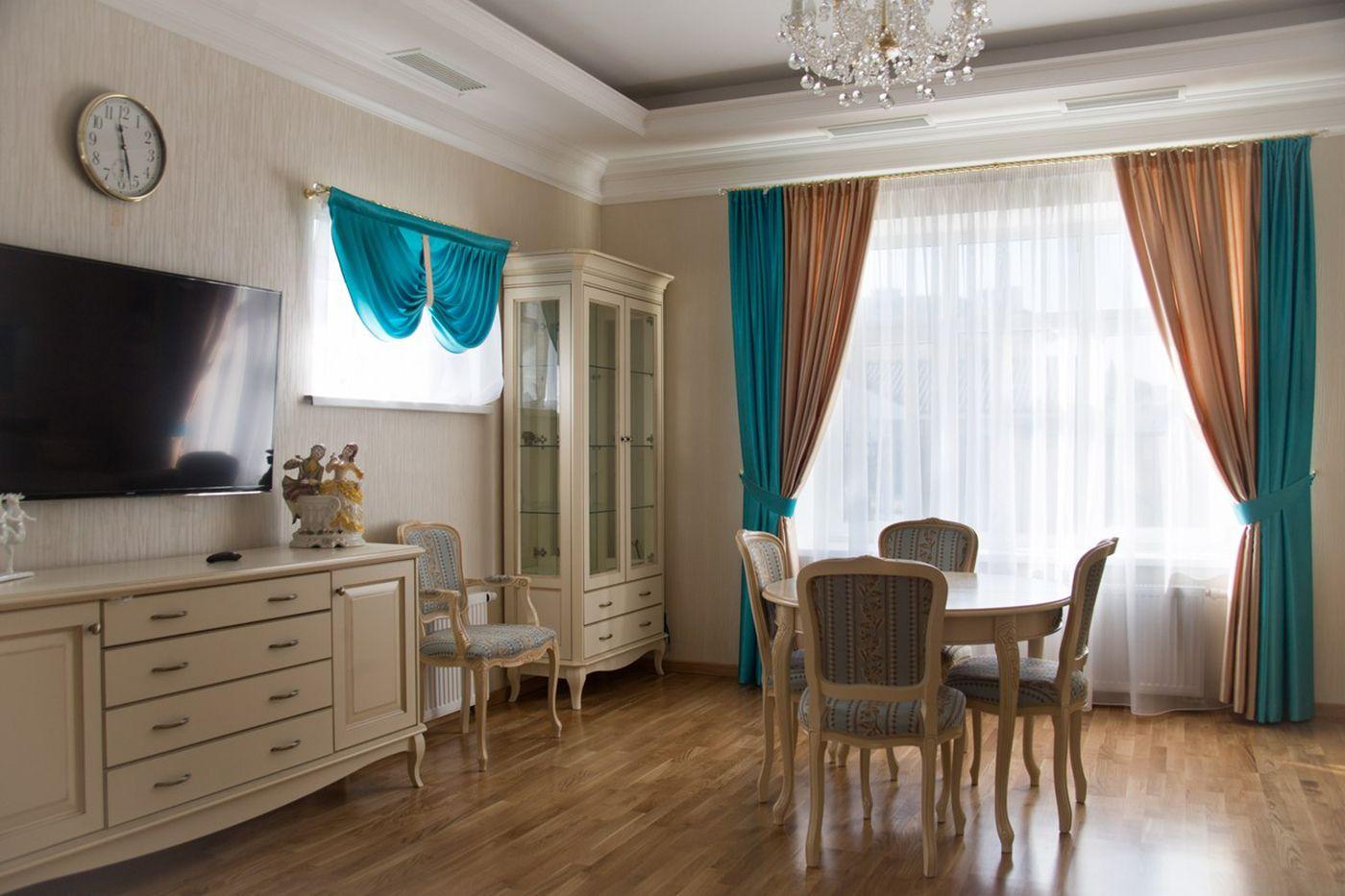
This color scheme is also successful because there is no strict dosing of colors in it. So, white can be either 20% or 70%. The same goes for the rest of the colors. Absolutely any of the main tones can prevail, and the rest will complement it.
Creating the most similar color scheme is very simple. There are no secrets here. If you are new to design, then you should turn to an easy and understandable algorithm:
- Step one. Choose blue and its shades. Even if it is less in percentage terms, it is still worth starting with it - it will determine whether your gamma will be warm or cold. So, jeans, ultramarine, indigo and periwinkle clearly gravitate towards cool colors, and turquoise and all pale blues towards warm colors.
- Step two. Choose white color and light shades based on the above. For a cold range, boil-white and grayish-beige are suitable, and for a warm one - milky, ivory, warm golden beige.
- Step three. Choose brown and dark beige tones. Again, it is worth starting from whether your palette is cold or warm. Interestingly, warm dark brown will suit almost any range, even cold ones, but you should not go too far with it.
It is noteworthy that the range of "Mediterranean coffee" is suitable for almost any room. The only thing to consider is the size of the room. Where the ceilings are high and there is enough space, you can allow the predominance of dark tones, while in a small room it is better to take white and light beige tones as a basis.
It is also worth thinking carefully about this color scheme when using it in a nursery or office. In the case of an office, it may lack the rigor that is so appreciated in a home office. And for a child, this scale may be inappropriate in temperament.
3. Shell coast
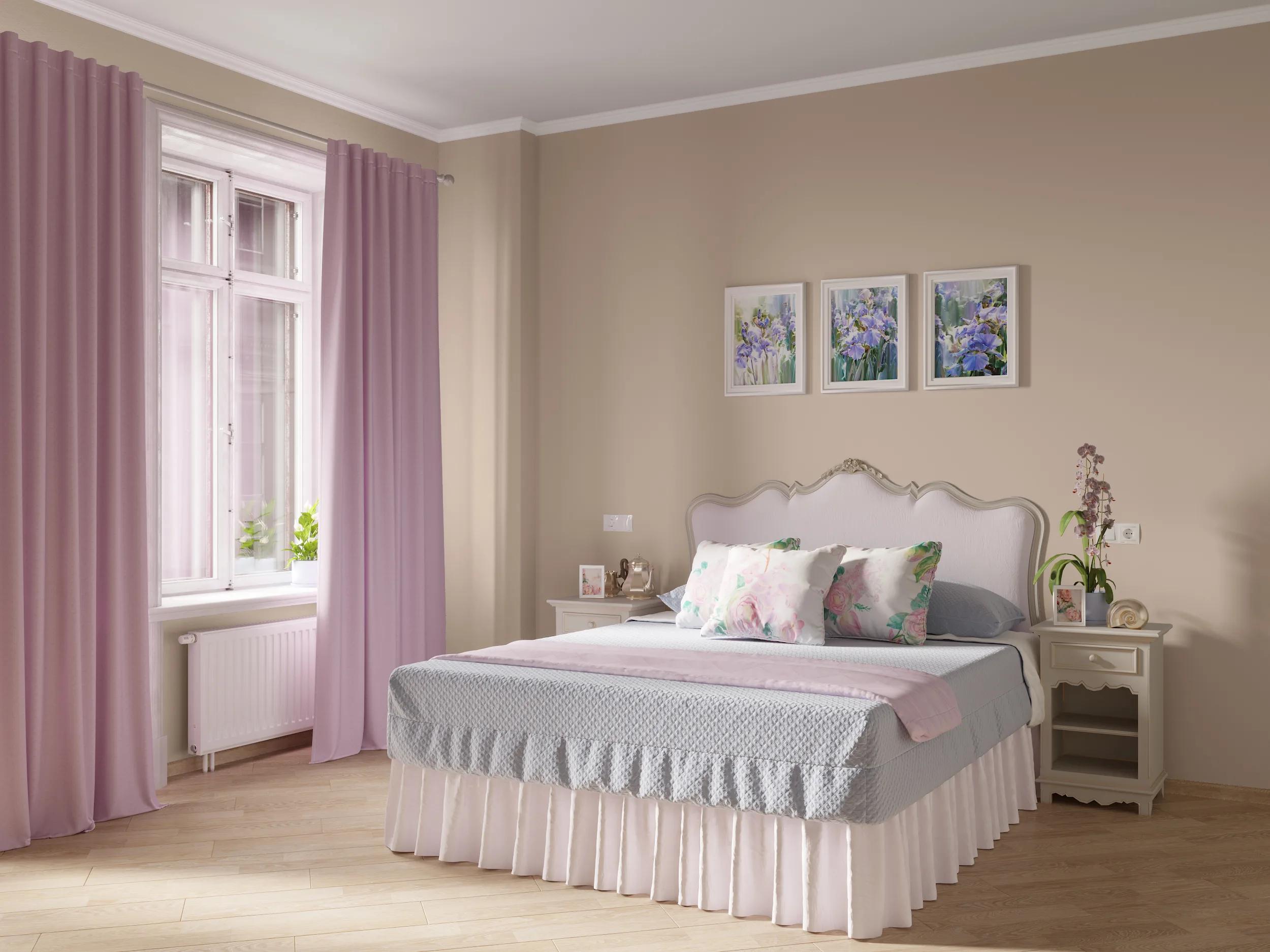
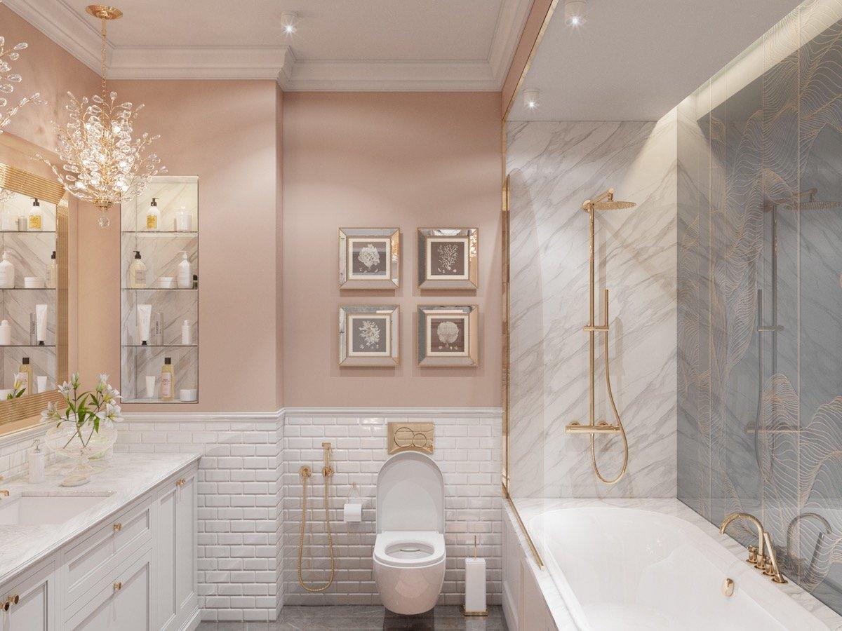
To understand this combination, it is enough to imagine a sandy beach with pinkish shells scattered over it. And not just pink. Imagine? Such a bright and at the same time rich interior is popular in 2022-23. Thanks to the unobtrusive shades that are included in this color scheme, this design will not become boring for years and will serve those who choose it for a long time.
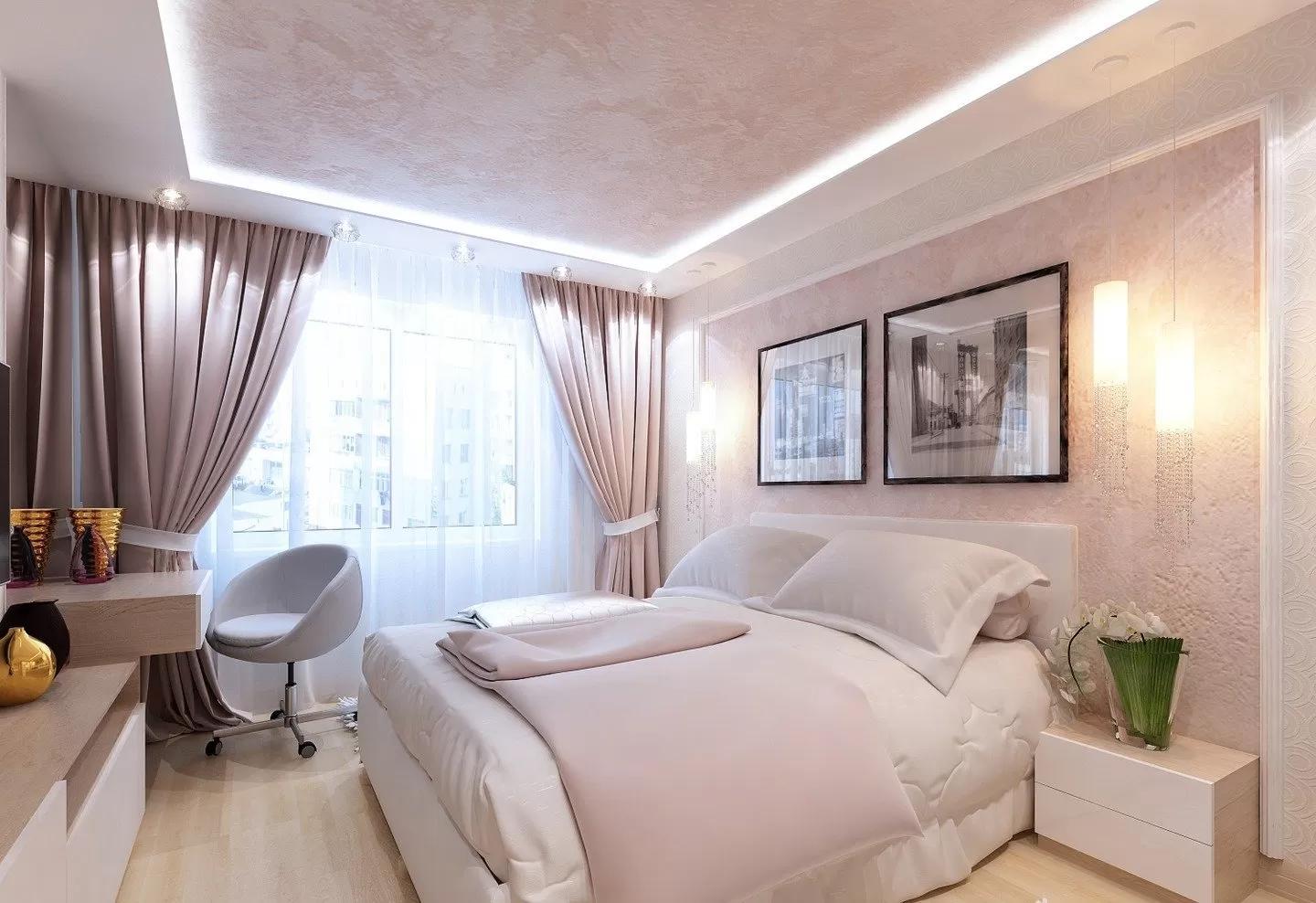
The main tones of the “shell coast” range are:
- light sandy and warm beige shades as a base;
- powdery color - can be both peach (warm) and clove (cold, slightly lilac) shade;
- golden and light brown tones;
- an additional color that appears literally interspersed: denim, muted olive, dusty terracotta or orange, cocoa with milk, etc.
The main feature of this color scheme is the almost complete absence of dark shades. The whole composition is built on light colors that do not contrast, but complement each other - while they should be quite different in color. This is just an imitation of the coast with shells, when the overall impression remains light, and upon closer examination it turns out that there are much more shades.
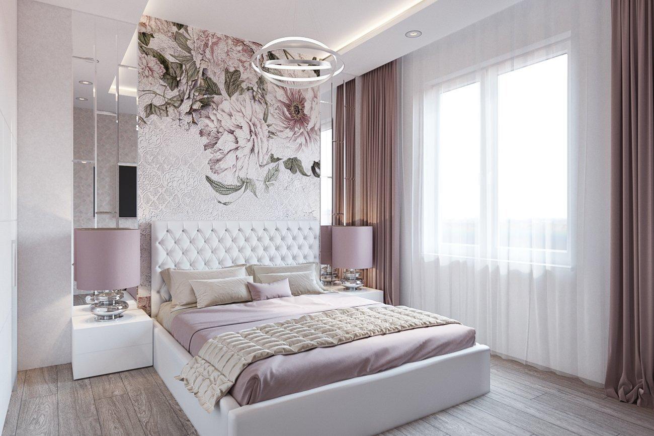
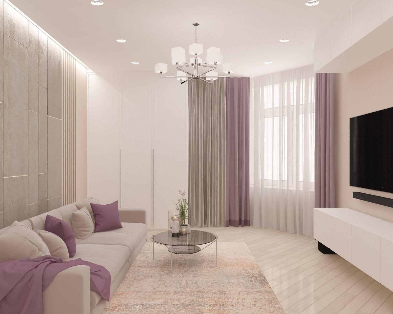
At first glance, it seems that creating such a color scheme and putting it into practice is quite difficult, but this is not so. The main thing is to take into account several important points:
- The first step is to choose the main tone: it is desert sand or light beige. Pay attention to what tones prevail - there is beige with a yellowish tint, there is pinkish beige, there is beige a bit more grayish. This will help you with the choice of further colors.
- Choose powdery. If your main beige is cold, then the “powder” should be the same (a lilac and blue tint, perhaps it should be a “faded rose” shade). If there is warm beige, it is worth choosing a “powder” of peach and flesh-pink tones.
- Finishing: choose not too catchy shades of golden brown. For a cold range, mahogany or cocoa (as well as cocoa with milk) is suitable, for a warm one - it's better gold, ocher or cinnamon.
- "Drops" make colors that fit well with what you have already chosen. If it’s hard for you to decide, stop at light denim - it will suit absolutely any combination.
"Shell Coast" is good in any room. It fits perfectly into the living room, bedroom, nursery, kitchen, dining room, bathroom, recreation area, utility rooms and even the exterior - for example, a veranda or a summer kitchen. Unobtrusive and at the same time interesting color scheme allows you to implement it in a variety of styles - from classicism to minimalism.
Interested in housing in Cyprus? Check the DOM website! The agency's website contains the largest real estate database in the country - more than 30 thousand residential and commercial properties throughout the island! Here you will find information about the latest development projects. Choose and contact professional brokers who will help you make the right choice!
Read also:
- The best residential family gated complexes in Limassol
- Is it profitable to buy land in Cyprus and build a house on your own?
- Hi-tech, constructivism and minimalism: popular interior styles in Cyprus
- School close to home: options for buying property near the most popular educational institutions in Cyprus
- How to prepare for wintering in Cyprus?
- 5 life hacks for using mirrors in the interior in Cyprus

