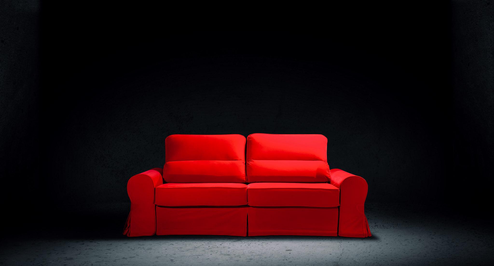
Red is the most saturated, emotional, and vivid color. That's why it's rarely used in interior design or completely avoided because it can be easy to "overdo".
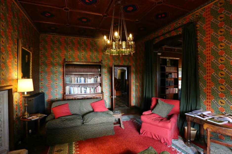
For popular interior styles on Cyprus, red and its shades are rarely used because traditions combined with new trends such as eco and minimalism do not include such a "dangerous" color. The island's interiors are characterized by either calm tones (natural, without contrast) or Mediterranean shades: blue, yellow (lemons), orange (oranges), green (emerald or olive), peach, sea wave colors, and more.
But that doesn't mean you should give up on red. On the contrary, if approached with intelligence, you can achieve amazing results and get one of the most unusual interiors for Cyprus!
What effect does the color red have on the human psyche?
It's no secret that red and its close shades are a powerful color that strongly affects people's senses. In addition, it evokes the most pronounced and sometimes contradictory associations (such as passion and infidelity, blood, and courage). That's why only a few decide on a purely red interior.

If the idea is executed correctly, the color red can have a very positive effect:
- Energize;
- Increase appetite;
- Stimulate imagination;
- Set a romantic mood;
- Give a feeling of warmth.
In large quantities, red can also have a negative impact on the nervous system. It should also be used with caution in a home where people with an unstable emotional background, prone to stress and depression, live.
The negative effects of red tones include
- increased aggression
- the appearance or intensification of stress
- increased tension and irritability
- a lack of measure (for example, in food consumption or disputes).
It's also worth remembering that the color red can quickly become boring. Therefore, people who know their own variability and love for new things should remember this feature before decorating their home.
All of this means that the proportion of red in the interior should be carefully considered. Sometimes it's acceptable to give up to 50% of the decor to bright colors, and sometimes it's better to limit it to small details. It's also recommended to pay attention to different shades of red - many of them have less pronounced effects. For example, pink is much calmer, and burgundy is not so exciting.
Shades of Red and Their Companions
Since almost no one makes a completely red interior, it is important to determine the entire color scheme. It is not so important whether your red will be the "central figure" or just a small nuance decor: successful combinations are the key to success.
So, the main shades of red and their companions:
1. Crimson and red proper. Combines with warm and cold white, gray, gold and copper, brown, yellow and orange tones, peach, denim, and cool beige. It can be combined with blue, lilac, and silver with caution.
2. Bright pink (magenta, neon). Combines with gray, cream, and beige, warm white (or ivory), various shades of yellow, violet, and purple. It can be combined with orange, brown, and turquoise with caution.
3. Light pink. Combines with gold and silver, all shades of beige, cool and warm white, blue and pale turquoise, natural shades of green (olive, herbal), brown, and warm yellow. It can be combined with orange, peach, bright pink, and crimson with caution.
4. Burgundy and dark cherry. Combines perfectly with pearl-gray, cool beige, brown, gold and copper, gray-green, black, and petrol. It can be combined with red, light turquoise, creamy, and aged silver with caution.
5. Coral. Lightened red combines perfectly with all pastel shades, pure red, light gold and silver, light and dark turquoise shades, black and brown, white (warm and cold), yellow (including lemon). It can be combined with light emerald, bright blue, and deep purple with caution.
Sometimes red and its shades can become an unexpected addition to the interior, which, it would seem, is not intended for such "inclusions." Therefore, it is very important to test everything in practice: then you can make a small design revolution in your home in Cyprus!
The Importance of Lighting
Usually, there are no problems with lighting in Cyprus: many houses and apartments have not only panoramic windows but also whole covered terraces, which are filled with sunlight 300 days a year.
Nevertheless, if you deliberately bought an apartment with windows facing north (to avoid hiding from the sun in the exhausting summer heat), then before adding red to the interior, it is worth thinking about good lighting.
Thus, red and burgundy simply get lost in dark rooms. The color stops "playing", turning into quite a gloomy and threatening one. In order to avoid this effect having a negative impact on the household members, it is necessary to give light to those areas where red or burgundy are concentrated.
The same applies to bright pink shades - but delicate pink ones feel good even in semi-darkness. They create a feeling of cozy twilight.
Red in the interiors of different rooms in Cyprus
For each room, it is necessary to carefully consider not only solutions with color combinations but also their use. Techniques that are suitable for the living room may not be suitable for the kitchen, bathroom, or children's room. Therefore, we will discuss the nuances of finishing each room below.
Note: by default, we will consider shades of red and scarlet.
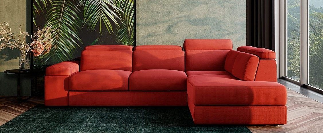
Red in a separate living room in Cyprus
A separate living room in houses and apartments in Cyprus is less common than an open-plan (i.e. combined with the kitchen). However, this option also exists, and using red in a separate living room is a good idea. The main thing is not to overdo it so as not to create a accidentally tense and tiring atmosphere.
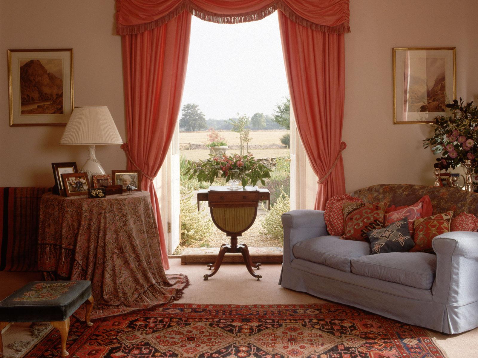
The first option is to place one red sofa or several red chairs, and then complement them with small "spots" (a small vase, a bold avant-garde painting, a small print on curtains).
The second option is to distribute red through textiles. For example, sofa pillows can match red curtains or a small carpet.
The third option is not to touch the furniture and textiles at all and focus entirely on wall finishes. For this, several colors of wallpaper or paint are taken, and red is among them.
To avoid losing coziness, it is better to combine red in the living room with the texture of wood, stone, or plaster. The companion colors should include at least one warm color. Harmony with gold or copper is allowed, but this should correspond to the style, because this technique is not suitable for minimalism or Scandinavian interiors. But it will fit perfectly into classicism or high-tech styles.
Red in a separate kitchen in Cyprus
As a rule, rooms in Cyprus, including a separate kitchen, have a decent area. Therefore, there is no need to worry about saving space (both physical and visual) and give free rein to your imagination.
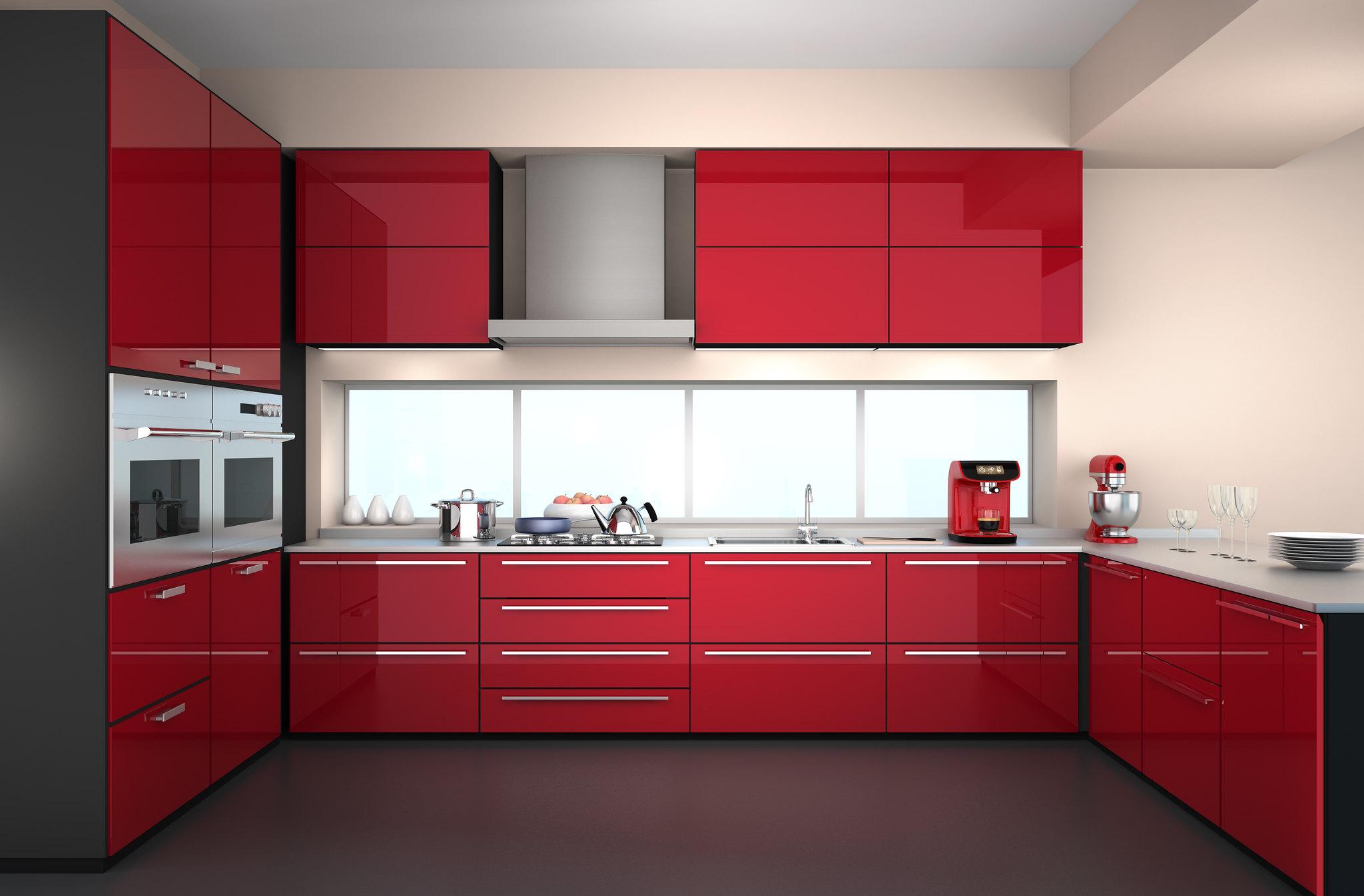
One of the simplest and most foolproof options is a red kitchen set. Usually, it is not fully painted in scarlet, but partially: only countertops or only cabinets. Thus, there is no visual overload, and additional decoration with red is not required at all.
Tip: glossy surfaces are often used for sets, although matte is a more calm and appropriate color for the kitchen. Moreover, it looks less flashy.
If you like this option, but you are not sure that there will not be too much red, try to implement the idea of a kitchen without a second tier. Thus, the red kitchen set will only be at the bottom, and you can leave free space on top or hang light shelves of a neutral color.
Another option, less radical, is a red "apron," supplemented with accessories of the same tone. It can be a print on textiles (curtains, rug, potholders), decorative dishes (plates, jars), or, for example, chair seats.
Red looks good in the kitchen interior either against very light tones (white, cream) or on a monochrome contrast (black + white). It is recommended to complement it with wood textures and prints or silver metals.
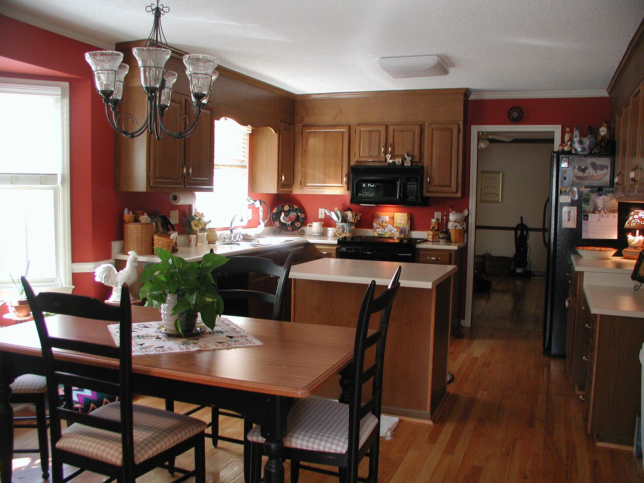
Red for open-plan living spaces
So, if your option is traditional for Cyprus and the kitchen is combined with the living room, then you should think carefully about where exactly you want to draw attention to the red color. Because a red kitchen set and a red sofa in one room - in 95% of cases, it's already too much.
If you have decided to make the kitchen red, then it will be enough to "scatter" small color accents around the living room. Moreover, it is desirable that red is not the only bright color in the overall color scheme: for example, take yellow, orange, or juicy blue as its companions. Remember that the "companion" should not be larger than the red itself. The opposite situation - there is red furniture in the living room, and the kitchen only "shades" it with bright accessories.
Red color in the bedroom in Cyprus
If the bedroom is well lit during the day, then you can be bolder and use more red. In this room, as a rule, the accent is easier to make on textiles: heavy curtains, bedding, bedspreads, and pillows. Decorative items complement the picture.
It is permissible to make a piece of furniture red, but then it should not be large or, if it is a wardrobe or a bed, be painted in bright colors only by 50%. Another complementary color should be neutral.
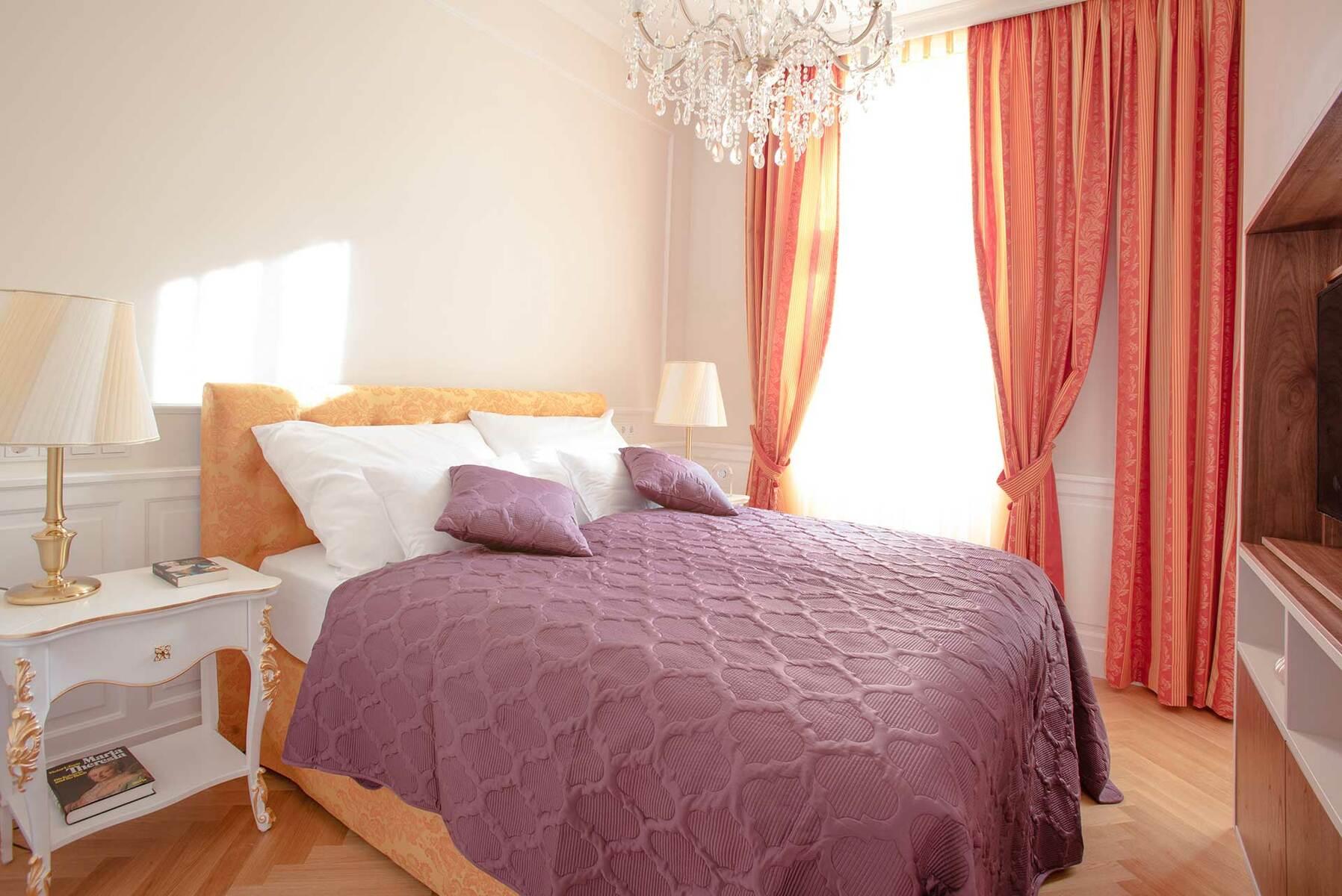
In the bedroom, it is recommended to avoid combining red with cool tones. It is better to choose something warm and pleasing to the eye: cream and beige shades, warm brown, peach, soft gold.
Red color in the office
A small amount of red color stimulates mental activity, tones up, and gives a boost of energy. But an excess of this shade can cause increased fatigue and even create a stressful situation under excessive tension. Therefore, it is necessary to strictly regulate the amount of red and remove it from the zone of constant visibility. A good option would be unobtrusive wall finishes or textiles. It is allowed for any shades of red to be present in stationery items. The only exception is if the work is creative, then it makes sense to think twice. Sometimes, red can distract or lead to intrusive ideas, which hinders creative thinking.
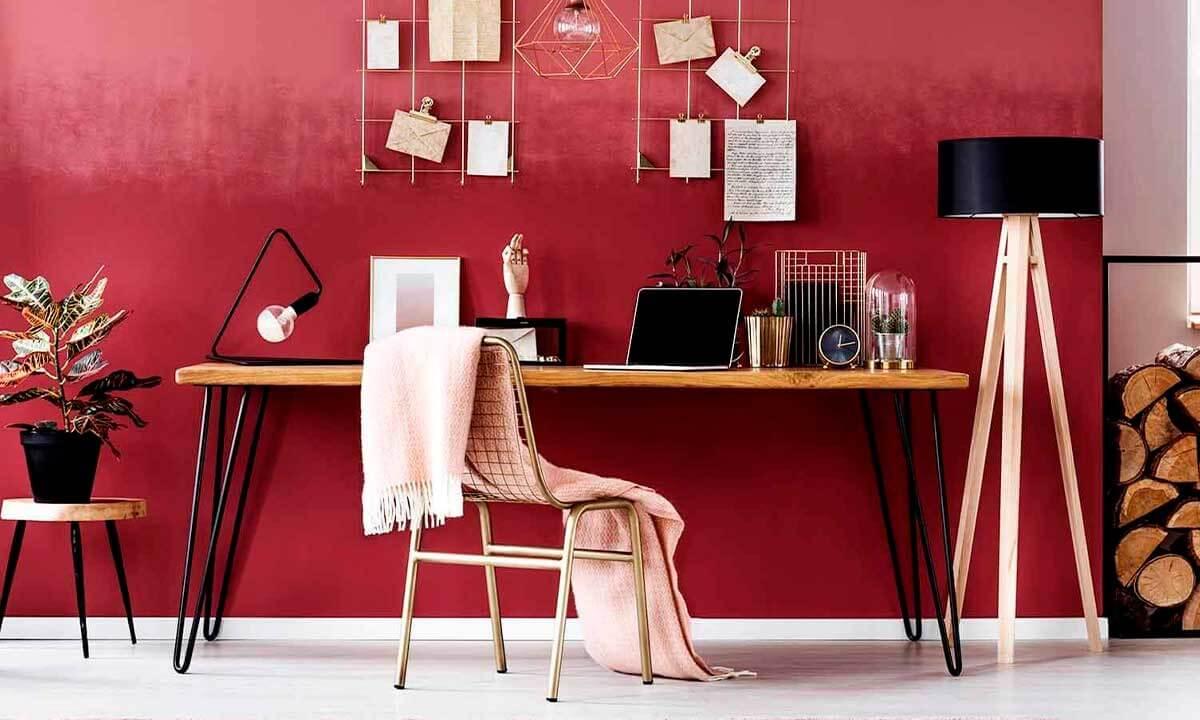
An alternative is a deep and calm wine color. Embodied in leather or matte surfaces, it helps to concentrate, calm down, and at the same time has a refreshing effect.
Red color in child's room
There is no need to be afraid of the red color in a child's room - a small amount of this shade only has a positive effect on children. Ideally, it should be combined with a couple of bright companions, while something light serves as the main tone.
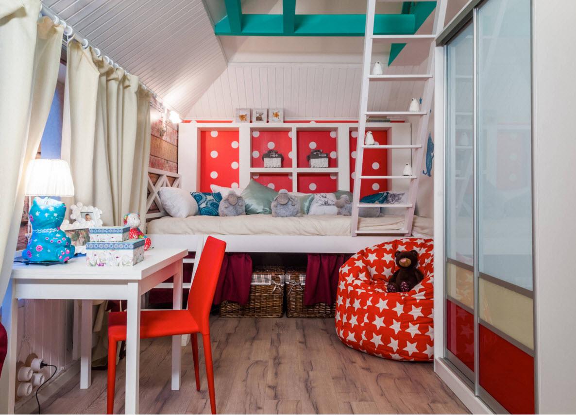
It is better to choose large furniture of calm shades, while the red color can be used for a chair, toy boxes, or textile decor. If your child has increased excitability or hyperactivity, it is better to avoid red in the field of view before bedtime (anything that the child sees from their bed).
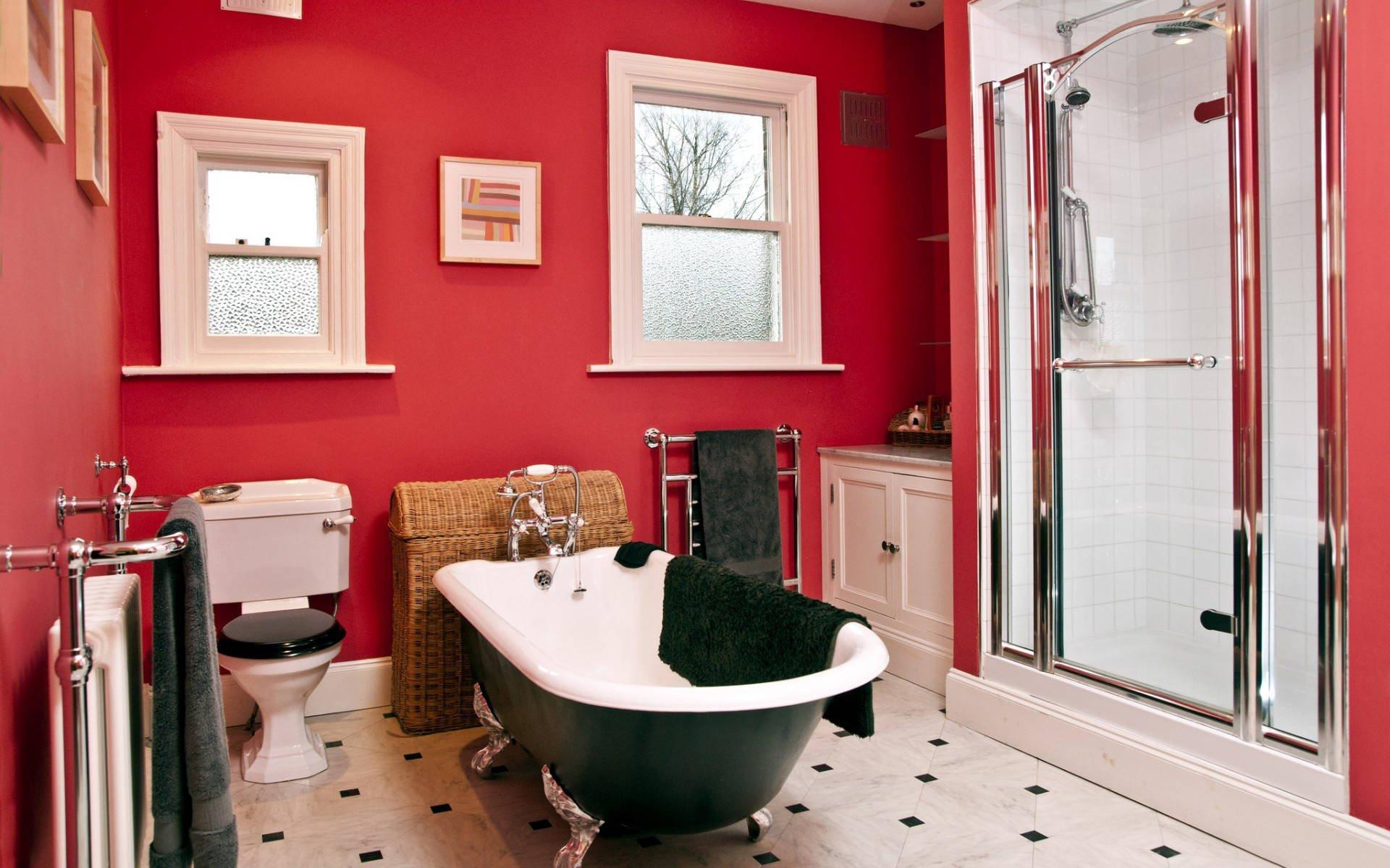
Red in the bathroom
Red and its shades are an excellent solution for refreshing the interior of any bathroom. The only nuance is the size of the bathroom, which can be quite small. In this case, it is worth stopping at red inserts: separate tile or open shelves.
Even in a large bathroom, it is not worth making it entirely red. It is permissible to use large red elements (baths or shower cabins, furniture), but they should always be combined with some other color. For this, ivory-white, glossy black or glossy gray is suitable, and you can add a little silver or gold to this color scheme.
Are you interested in real estate in Cyprus? Check out DOM! The agency's website offers the largest database of real estate in the country - more than 30,000 residential and commercial properties across the island! Here you will find information on the latest development projects. Choose and contact professional brokers who will help you make the right choice!
Also read:
- 10 ways to reduce electricity costs in Cyprus
- Two floors, a terrace, and a gorgeous sea view: new developments in Cyprus with exclusive apartments
- Paphos or Limassol: pros and cons
- TOP 5 mistakes in the interior design of a new apartment
- TOP 10 residential projects in Nicosia with permanent residency included
- How to find the market value of your apartment in Cyprus